
In this article, you will learn how to make a bar graph in Google Sheets. Let’s do it.
Table of Contents
YouTube Video: How to make a bar graph in Google Sheets
To make it very convenient for you we have made a YouTube video on how to make a bar graph in Google Sheets. Please click the above link, have a look, and be sure to subscribe.
How to make a bar graph in Google Sheets
Creating a bar graph (bar chart) in Google Sheets is a straightforward process. Here are the steps:
Related: How To Make A Graph In Google Sheets
1- Open your Google Sheets document: Go to Google Sheets and open the spreadsheet where you want to create the bar graph.
2- Enter your data: Make sure you have a set of data to graph. Typically, you’ll have two columns: one for the categories (X-axis) and one for the values (Y-axis).
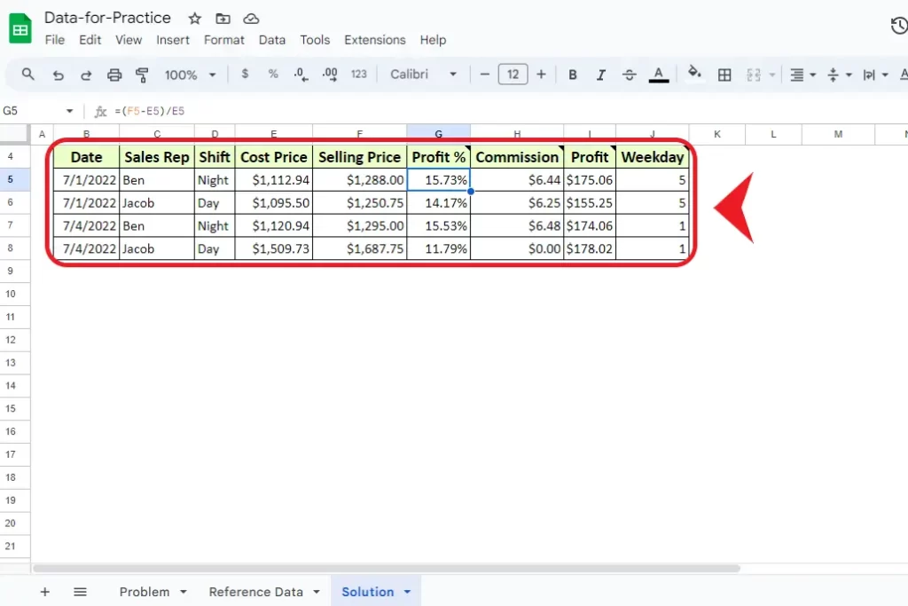
3- Select the data you want to include in the graph: Click and drag to select the range of cells that contain your data. Typically you will select two sets of data alongside i.e. columns or two rows to show on the graph. However, you can also select one row or one column to show on the Y-axis and later you can select the X-axis manually.
If you have made the chart but want to add an X-axis to the chart as a label then simply in the chart editor setup and add the desired range in the X-axis that you want to show as an X-axis.
Related: How To Highlight Duplicates In Google Sheets
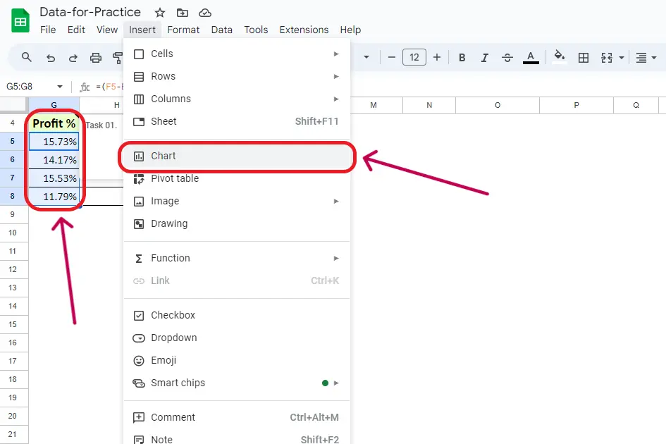
4- Insert the chart: Click on the “Insert” menu at the top of the screen. Choose “Chart” from the dropdown menu.
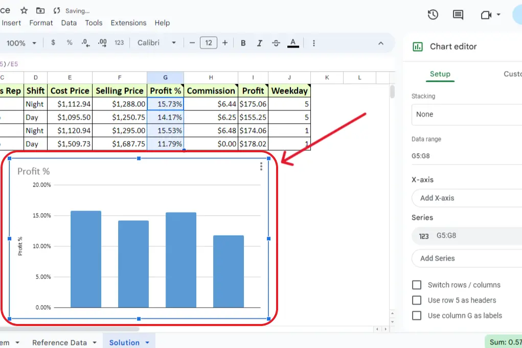
5- Configure the chart: In the Chart editor on the right-hand side. Choose the “Chart type” as “Bar chart.” Adjust any other settings as needed, such as the title, axis labels, and legend.
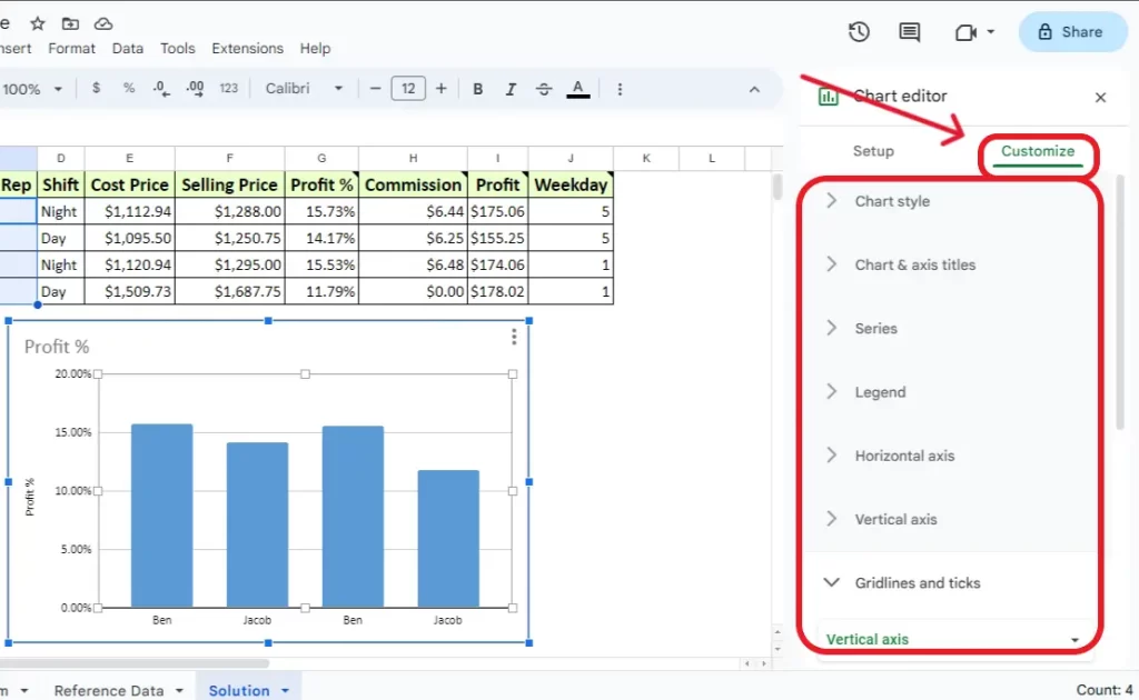
6- Customize the chart further (optional): You can customize the appearance of the chart by clicking on the chart itself and using the three dots that appear in the upper right corner of the chart to access the chart menu. From there, you can choose “edit chart” to modify various settings by clicking on “customize”..
7- Close the Chart editor: Once you’re satisfied with the chart configuration, click the “X” in the top-right corner of the Chart editor to close it. Your bar graph should now be visible in your Google Sheets document. If you make changes to the data, the graph will automatically update to reflect those changes.
If you have category labels in the first column, and values in the second column, Google Sheets should automatically recognize this and create a bar chart accordingly. Adjustments can be made in the Chart editor if needed.
Related: Have a look at the alternate guide from the official Google help forum on How to make a Bar Graph in Google Sheets.
Related: How To Make A Pie Chart In Google Sheets
Conclusion
In conclusion, mastering the creation of bar graphs in Google Sheets adds a dynamic visual dimension to your data presentation. This comprehensive guide has walked you through the process, ensuring you can effortlessly transform your spreadsheet data into a clear and impactful bar chart.
The accompanying YouTube video, “How to Make a Bar Graph in Google Sheets,” will provide visual reinforcement for an enriched learning experience. Whether you’re adjusting chart types, titles, or axis labels, the customization options empower you to tailor the graph to your specific requirements.
Remember, the automatic recognition of category labels and values streamlines the chart creation process, and any modifications made to your data will seamlessly update the graph. Elevate your data visualization skills with Google Sheets and make your information more engaging and accessible.
Related: How To Sort By Date In Google Sheets
Frequently Asked Questions
How do I make a simple bar graph in Google Sheets?
To create a simple bar Graph in Google Sheets simply select the two columns and then go to Insert –> Chart –> Chart Type –> Bar Graph.
How do I create a data bar in Google Sheets?
You can create a data bar in Google Sheets by using Bar Graph. To create a Bar Graph in Google Sheets simply select the two columns for that you want to create a data bar. Then go to Insert –> Chart –> Chart Type –> Bar Graph.
How to make a bar graph in Google Sheets – YouTube
Here is the link to the YouTube video on How to make a Bar Graph in Google Sheets. Click on it and you are on the go.
How to make a bar graph in Google Sheets with multiple columns
On a 2D graph, you can only show two columns on a Graph in Google Sheets. To make a Graph select the two columns that you want to show on a graph and go to Insert –> Chart –> Chart Type –> Bar Graph.
Related: You can also have a look at guide from another website on How to make a Bar Graph in Google Sheets.

Really enjoyed this post, can I set it up so I receive an email when you write a new update?
Yes you can use subscribe button to get emails updates.